
Retro Bedroom Portfolio
This Very Site
Overview
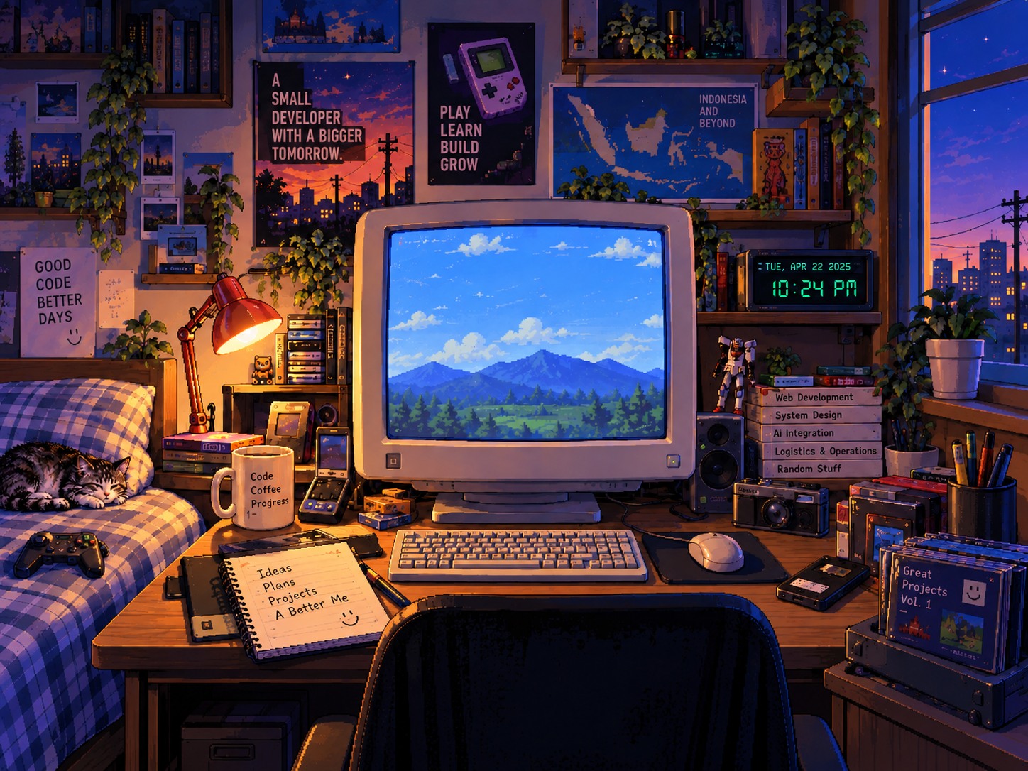
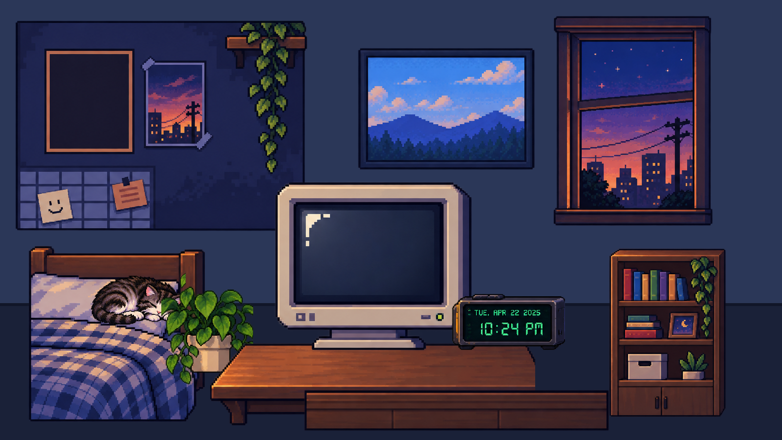
This portfolio is itself a project: an interactive room scene inspired by 2000–2005 bedroom PCs, point-and-click games, CRT displays, and pixel icons. The rule is portfolio first, game-like second — every piece of content is semantic HTML reachable by direct URL, and the adventure layer never gates access. It is built with Astro content collections, a documented design system, and a phase-by-phase spec-driven process.
Problem
Developer portfolios blur together — the challenge was being memorable and expressive without sacrificing accessibility, performance, or direct access to content.
Solution
A content-first architecture: projects, experience, and skills are structured content rendered as semantic HTML on direct routes, with the retro bedroom scene layered on top as enhancement rather than a gate.
Responsibilities
- Wrote the full spec — PRD, design system, interaction and motion specs, accessibility, performance budgets
- Built the Astro site — content collections, layouts, and a hand-rolled retro UI component kit
- Designed and produced the pixel-art asset pack and original WAV cues
- Held the accessibility line — keyboard access, reduced motion, audio off by default
Key Features
- Interactive bedroom scene with hotspots and a quest log
- File-explorer project browser with per-project case studies
- Direct-route URLs for all content — no puzzle required
- Original pixel-art assets and WAV UI cues
- Reduced-motion and keyboard-first support
Technology
- Astro
- TypeScript
- Content Collections (Zod)
- Scoped CSS
- Static output
- Pixel-art asset pipeline
Technical Decisions
- Portfolio first, game-like second: A visitor must reach every project and the contact page without solving a puzzle — the room is enhancement, not a gate.
- Content collections as source of truth: Projects are typed JSON documents rendered through a schema, so case studies stay consistent.
- No heavy framework: Static Astro output keeps the site fast; the retro UI is hand-rolled instead of pulled from a component library.
Impact
- Doubles as a living demo of spec-driven design and front-end craft